
How film posters capture the soul of a movie?
and a list of my favourite film posters

Why Film Posters matter to me?
"The poster is the soul of a movie made visual."
— Akiko Stehrenberger, award-winning movie poster designer
A film poster is a visual used to promote and advertise a film primarily to persuade paying customers into a theatre to see it. They are often the first visuals you see for an upcoming film and are loved and adored by film buffs around the world.
I have been a film buff since my early teens. It started with a weekly childhood ritual. Every Thursday I would watch a new film at the local movie theatre close to our home with my father. I looked forward to this day throughout the week. We never discussed what film to watch. We just went and watched whatever was playing in the theatre that week. We did this week after week for most of my teens. It was a way for us to bond and connect with each other through the films we saw on the screen. We always ended a movie with a delicious meal at a restaurant nearby. It was one of my favourite childhood traditions and rituals.
However the poster for the upcoming film would come out a few days before the screening. It would be displayed all around the movie theatre to promote the film. This was before the wide proliferation of social media and digital technology. I would take one glance at the film poster and make several conclusions about what to expect that week. Was this an action film? Was this a thriller? Was this a family drama? Was this a comedy?
I soon developed a mental model for what was normally included in these film posters.
Each film poster had a fixed set of common elements. I realized that colours played an important role because red signified passion or anger while green signified nature or rebirth. The objects displayed around the characters in the poster would eventually play an important role in the film. The clothes worn (and not worn) by the characters in the film poster told you important details about their personality. The typography used also varied for each film because I saw serif fonts used for dramas and romantic films and sans serif fonts used for thrillers and action films. The use of white space could give you a glimpse of how open or irritable the protagonist would be in the film. Some posters had a punchy tagline or a review from a leading publication or magazine. The credits appeared at the end of a poster with the names of the production team and lead actors at the bottom of these posters.
Eventually I fell in love with the movies and film posters had a big role to play in helping me come to this realization.
"A movie poster is not just an ad — it’s a promise."
— Drew Struzan, poster artist (Star Wars, Indiana Jones, Back to the Future)
A Visit to a Film Posters Museum
"A good poster is like a good teaser trailer. It doesn’t give away much of the film but then you can watch it back and say…Oh…Now, I get it."
— Elliot Ulm, graphic designer
This love for film posters was reignited on a recent visit to The Museum of Bollywood Posters1 in Mumbai, India.
This is a free public museum in Mumbai that houses hand-painted as well as digital posters of Bollywood films from the 1950’s to the 1970’s. Here are some notes and random thoughts on Film Posters from my recent visit to this unique museum.
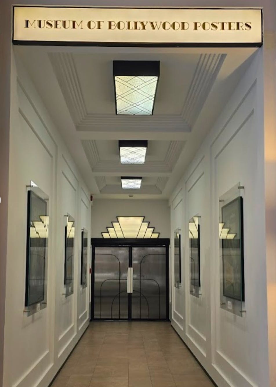
The posters housed in this museum were vital to build excitement for a film during its release. There was no internet, social media or music videos to promote films to a mass audience in that time, so film makers had to rely on hand painted posters and wall murals to promote large budget films to an audience that spoke many different languages.
A poster has to capture the emotional core of a story in one visual.
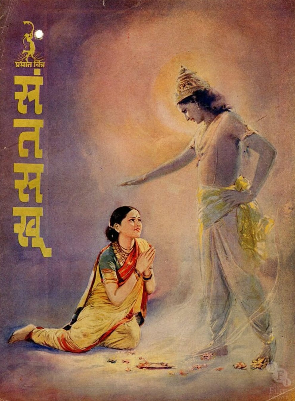
There are posters of iconic films like Anmol Ghadi (1946), Mother India (1957), Karigar (1958), Love in Simla (1960), Kohinoor (1960). The success of a film was often dependent on how many people went to watch this film over a single weekend. Careers were on the line because each film had hundreds of people involved in its production.


But beyond the commercial reasons to create a good film poster there was also the simple joy of creating an artwork that captured a basic human emotion.
Love is a common theme in many of these posters. But the characters also feel anger, hope, jealousy, pride, sadness and fear as captured in these visuals. You can see this represented in the body language and facial expressions of the actors in each poster. The colours also bring the poster to life because they carry their own sense of heaviness and lightness in them. And finally there are the film credits which normally listed the actors, directors, musicians and producers even though the project had so many other technicians involved.


My walk through the museum built a sense of nostalgia, because a good film captures something essential about the time period in which it was created. So I made a list of films I have to watch inspired by these posters and hummed the songs in some of these films as I walked out. I highly recommend this museum to any film enthusiast visiting the city. Grishma Udaywar created a video about her visit to this museum on her channel linked below.
My visit to this museum got me curious about this world of film posters. What is the history of the use of posters in film promotion? When did this first start? How does it change across cultures?
"A good poster makes you feel something — fear, excitement, nostalgia — in a single frame."
— Scott Saslow, film marketing strategist
History of Film Posters
"Movie posters don’t just tell stories about the films they represent. They also give a glimpse into the culture and period in which they were created."
—Team from Film Art Gallery
Film posters are about 150 years old2. It is a relatively new art form that emerged with the birth and rise of moving pictures as a popular media form.
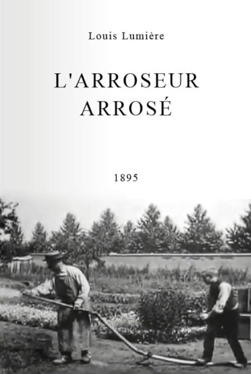
In the early 20th century, film posters emerged as a theatrical extension of advertising, heavily influenced by the aesthetics of stage performances and the printing techniques of the time. These early posters were more about promoting the novelty of moving pictures than conveying a film’s narrative. As cinema grew in popularity, posters became a critical marketing tool, introducing audiences to the idea of movie stars and genre branding. In France, the poster for L’Arroseur Arrosé (seen below) a 1895 short black and white silent film, is considered the first poster ever designed to promote an individual film3.
By the 1920s and '40s, as the studio system matured, film posters evolved into highly stylized illustrations that emphasized dramatic scenes, romantic pairings, and marquee names. This was the golden age of hand drawn posters, dominated by the visual glamour of classic Hollywood. During World War II, posters often carried patriotic undertones or offered escapism through musicals and noir thrillers. Artists used rich color palettes, bold typography, and carefully staged compositions to reflect the era’s storytelling traditions. Meanwhile, international markets such as Poland, France, and the Soviet Union started cultivating their own unique poster traditions—often more abstract and avant-garde than their American counterparts. Each country had its own tradition of film posters. In India, the earliest hand-painted Indian film poster could be traced back to Kalyan Khajina (seen below), a 1920s historical Marathi film. It was created by Baburao Painter4.
The 1950s through the 1980s marked a dramatic shift as posters began incorporating photography, collage, and increasingly cinematic compositions. This era also saw the rise of the "floating heads" trend, where star power was visually emphasized over storytelling. As genre cinema exploded with horror, sci-fi, and action leading the way posters became more sensational and dynamic, using striking color contrasts, exaggerated poses, and custom typography to hook audiences. The poster was no longer just an ad; it became an artifact of pop culture.
From the 1990s onward, digital design and global marketing began to dominate film poster creation, leading to both innovation and homogenization. Photoshop replaced brushwork, and marketing teams began designing posters for maximum impact across billboards, DVD covers, and online thumbnails. Teaser posters, character posters, and motion posters became standard marketing tools. While many mainstream posters began to follow formulaic trends, there was a simultaneous renaissance of alternative poster art driven by designers, illustrators, and collectors.
Today, the film poster is as much a storytelling device as it is a branding tool. But what are the parts or elements of a poster.
"You only have one glance. The job of the poster is to make that glance last longer."
— Bill Gold, poster designer (Casablanca, A Clockwork Orange)
What are the Elements of a Film Poster?
"Posters don’t sell tickets. They sell desire."
— Mark Harris, film critic and author
I have not designed a film poster myself. So I thought I could find answers to this question by using resources created by agencies and independent film poster designers. I will share a short summary of each video at the bottom of the link.
In this video, Daisy Ein from Envato Tuts+ explores what makes a great movie poster and discusses some of the basics of film poster design. Movie poster have come a long way from hand drawn illustrations to photography to digital graphics. The common poster size seen in movie theatres is 27 inches by 40 inches. It is what you see in the hallways of movie theatres. The other common size is 40 inches by 60 inches and that is seen in bus stops and subways. The poster size sold to consumers and collectors for home use is 24 inches by 36 inches. These sizes change for digital posters and the platforms they are posted on over time. Movie title, release date and credits are normally included in a poster. The centre of a film poster is normally reserved for a photograph of the main character or a symbol that represents the ideas in the film. They also threw light on how poster design is also connected to past poster designs trends in a specific genre like Sci-Fi, Action, Thriller or Comedy. Here is a list of my top 100 film posters on Letterboxd that includes some of the elements mentioned in this list and has films from a bunch of different genres.
In this video, James Verdesoto from Indika Entertainment, talks about colour trends in Hollywood film posters. The white background in a film poster is often used in comedies and focuses on stories with less character detail. The blue hazy background in a film poster is used in fast paced thrillers. The yellow background provides an independent voice and sell smaller films. Black, white and orange is a recent trend to show movement or explosion in modern action films. Blue and orange has become a sure fire approach in big budget Hollywood films as it provides good and eye catching contrast. You can review posters designed by James Verdesoto at this link.
In this video, Rajeev Chudasama, the founder of Marching Ants talks about how his agency designs film posters for large budget Bollywood films. He spoke about balancing the expectations of producers, directors and actors. He normally organizes a day long shoot to capture images of the cast that can be used in the poster. The team has extended discussions with the writers and directors to capture the soul of the film that is then translated into a single visual. He emphasized that each film poster should focus on clarity, typography and a clear idea of the essence of the film. You can review the posters designed by this agency at this link.
"A great film poster tells a story — before the story."
— Paul Shipper, illustrator and designer for Doctor Strange, Stranger Things
Why Film Posters should matter more to you?
"Posters are the first impression. They’re a whisper that says, ‘Come closer. There’s a story here just for you.’"
— James Verdesoto, designer of Pulp Fiction and Training Day posters
Making a film poster must be such an exciting creative challenge. You have to capture the essence of the story in one visual. This visual may include photos, colours, text and more. But the success of a poster is largely dependent on its ability to capture the essence of the story in one visual.
I think the quality of a film poster is also dependent on what is left unsaid.
What part of the characters traits do you chose to focus on in the film poster? Why do you chose those traits over others to display on the film poster? What colours best represent the mood of the film? What colours do not represent the mood of the film? How much of the poster does the main character’s photo cover? How much space do you offer the supporting cast? There are so many entry points to analyze and discuss the impact of a film poster. Here are some I noticed in my journey as a film lover.
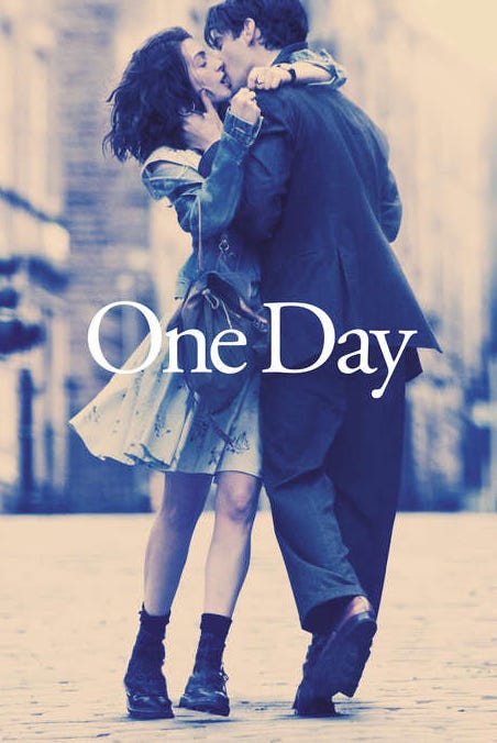
In some film posters the body language of the characters on the poster communicates some information about the nature of their relationship as seen below in the One Day (2011) poster.
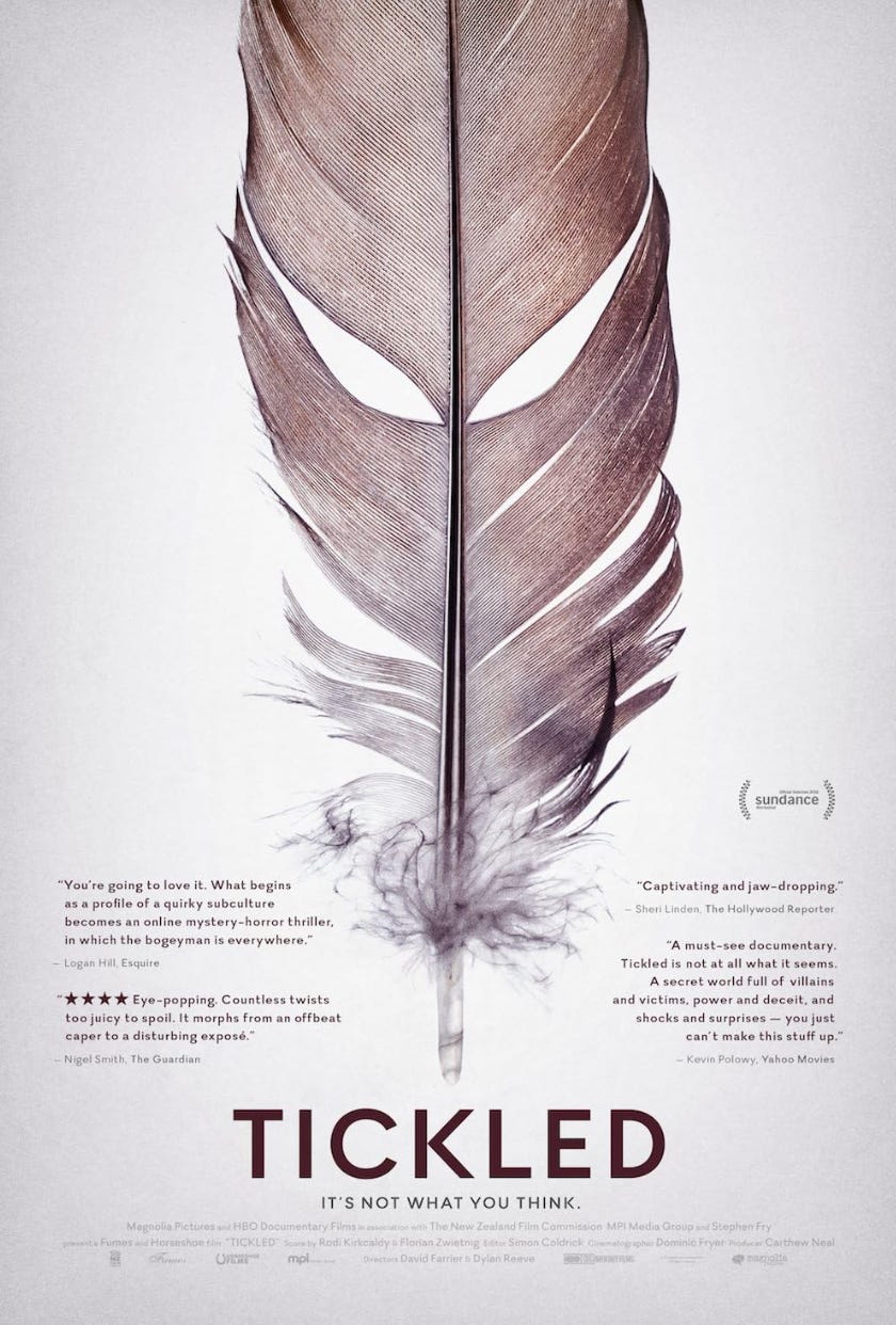
In some film posters they use a symbol that represents an idea being depicted or being explored in the film as seen below in the Tickled (2016) poster.
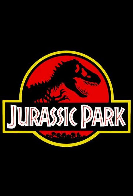
In some film posters they use text to communicate emotions associated with the film. Serif fonts are used for dramas and romantic films and sans serif fonts used for thrillers and action films as seen below in the Jurassic Park (1993) poster.
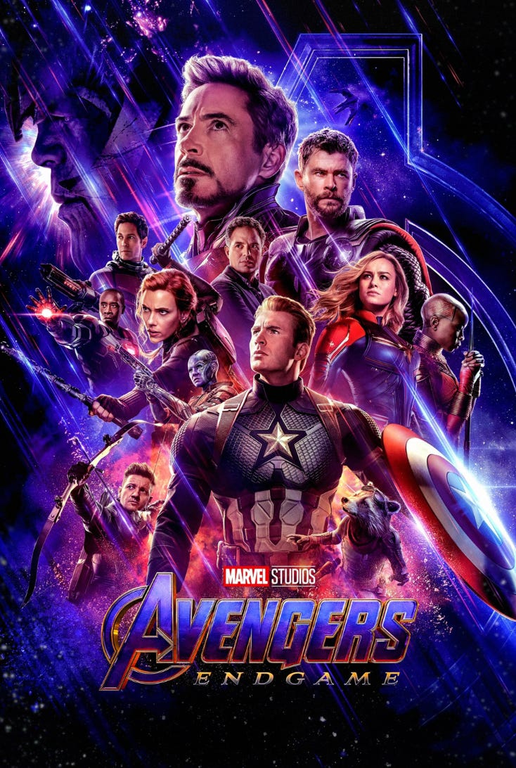
In some film posters they focus on the placing and positioning of characters in a film poster to signify power dynamics and important roles as seen below in the Avengers Endgame (2019) poster.
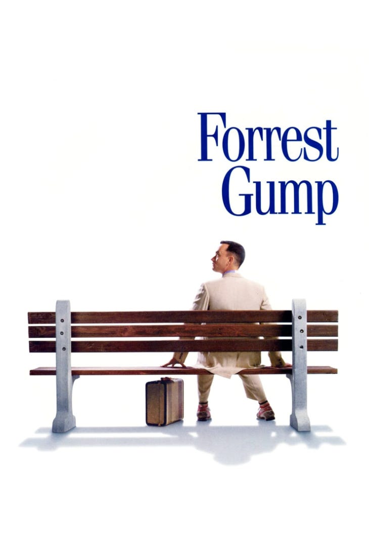
In some film posters they focus on using images of objects that hold importance to the main character as seen below in the Forrest Gump (1994) poster.
Film Posters should matter more to you because they are an art form in itself. The poster designer has to capture the essence of the story in a single visual. They are the viewer’s first impression of a film and capture the core of the story. A film poster can mean different things to different people depending on the associations you come into a film with as a viewer. Effective posters use photos, illustrations, symbols, objects, text size, typography, colours
Above all a film poster is an honest attempt by a film maker to tell the viewer that this film is worth their time.
I hope you enjoyed this essay on film posters. What are your favourite film posters? Please do share an IMDB, Letterboxd or Movie Website Link to the same in the comments. I have attached images of my top 100 film posters on Letterboxd at the end of this post.
Until next time,
Keep Learning.
Abhishek Shetty
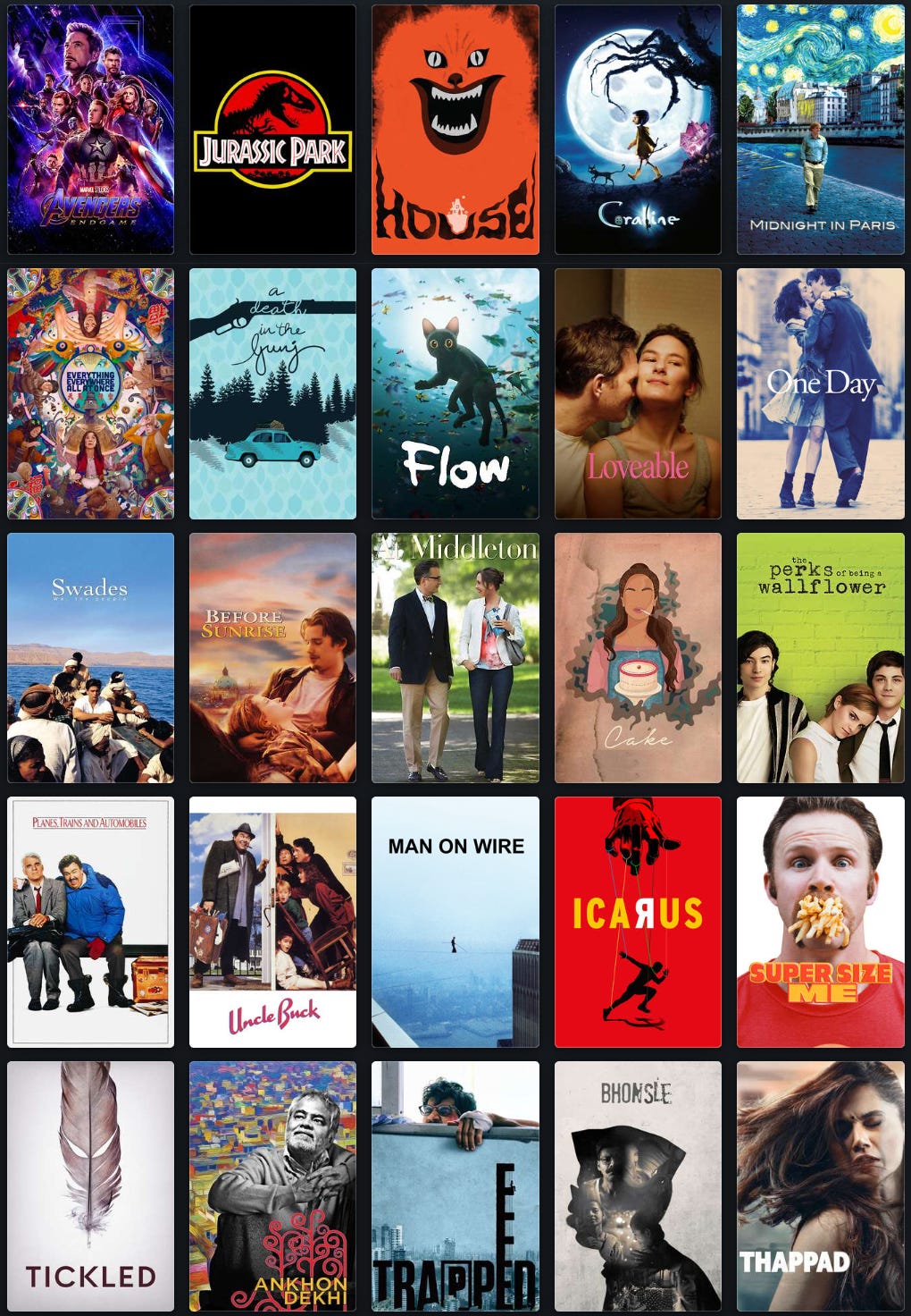
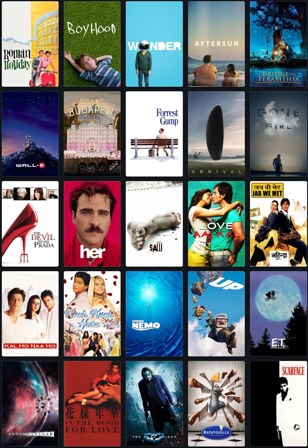
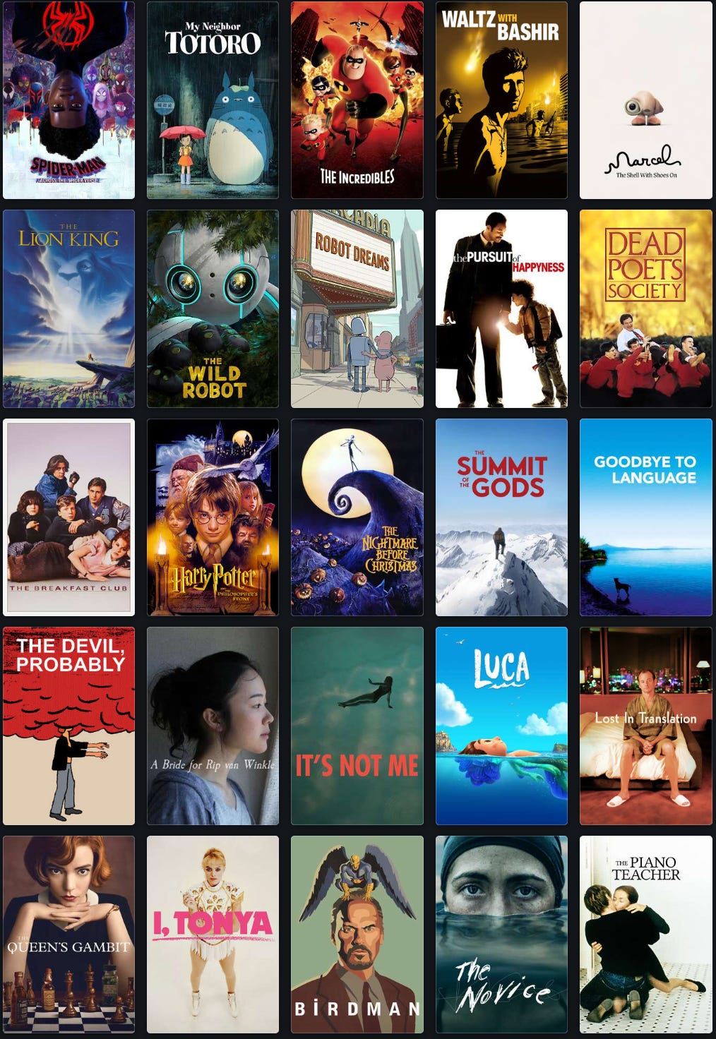
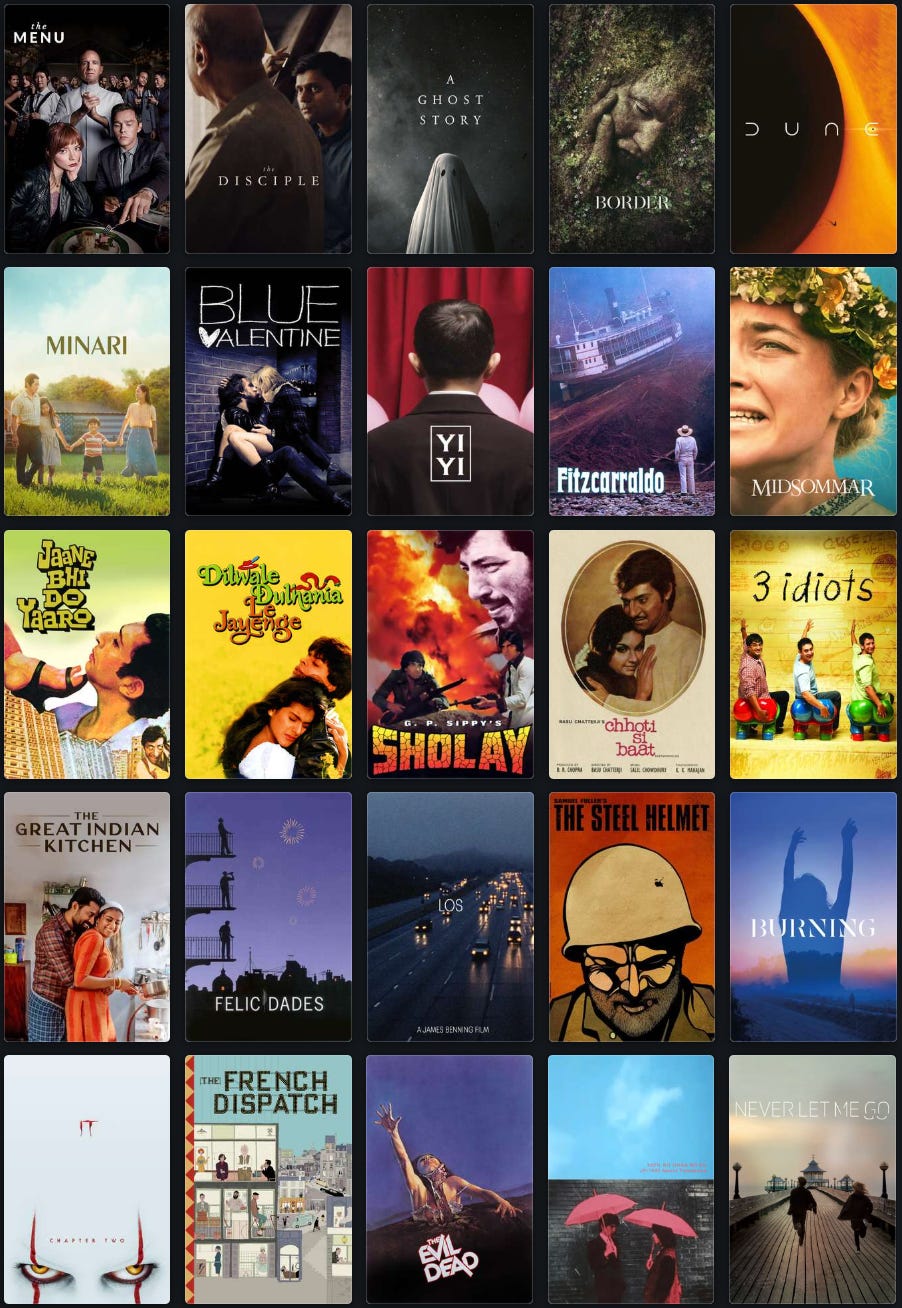
My Top 100 Film Posters
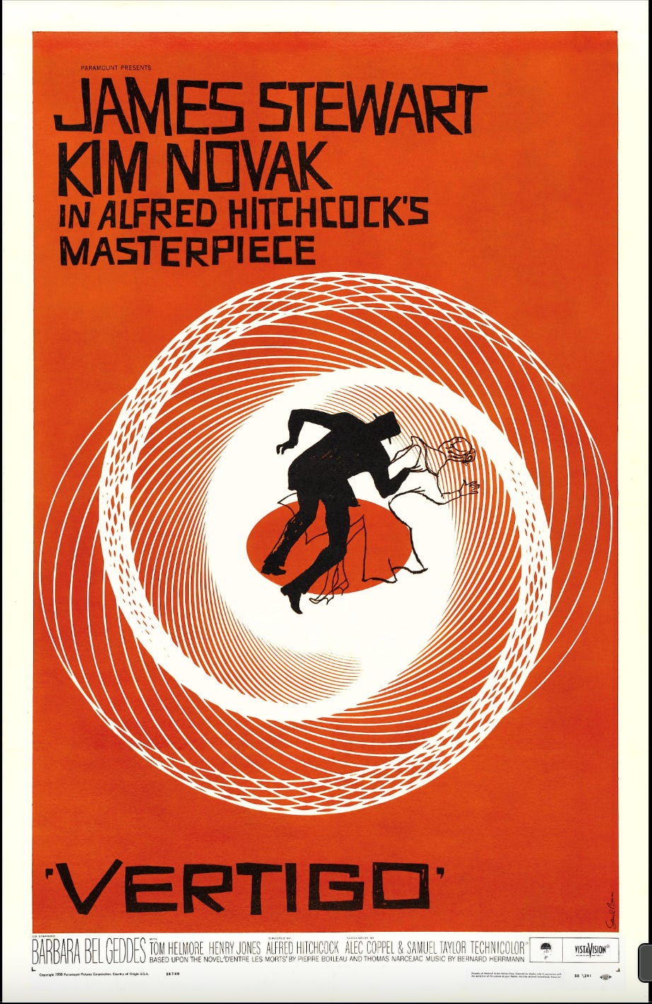
Here is a list of my top 100 film posters on Letterboxd. I have added visuals from that list below. You can also follow me on Letterboxd for film reviews and poster recommendations.
Notes
Khushboo, K. (2023, November 08). Sanctuary for timeless films, The Museum of Bollywood Posters in BKC is a treat for cinephiles. Accessed on June 4 2025 from <https://www.knocksense.com/mumbai/sanctuary-for-timeless-films-the-museum-of-bollywood-posters-in-bkc-is-a-treat-for-cinephiles>
film/art Gallery. (2024, March 09). The History of Movie Posters. Accessed on June 4 2025 from <https://filmartgallery.com/blogs/news/the-history-of-movie-posters?srsltid=AfmBOormYHg0aoYjFk4HUnlqUrKMAFLYjHe7f7B9BPZhjfEnokzoiAi2>
Rees, C. (n.d.). Coming Attraction: The World’s First Movie Poster. Intelligent Collector. Accessed on June 4 2025 from <https://intelligentcollector.com/coming-attraction-the-worlds-first-movie-poster/>
Sarkar, V. (2021, June 08). From Hand-Drawn To Digital: The History & Evolution Of Poster Art In Indian Cinema. Homegrown.in. Accessed on June 4 2025 from <https://homegrown.co.in/homegrown-creators/a-homage-to-the-dying-art-of-hand-painted-bollywood-posters>
I love minimalist movie posters!
Since you are passionate about film posters, you might enjoy Jahan Singh Bakshi's work.
https://www.mid-day.com/sunday-mid-day/article/posterphilia-on-instagram-is-all-about-trippy-world-of-film-posters-19983151