
How typography, colours and symbols bring brands to life?
A personal essay on how humans relate to the brands they consume.

I was walking around the mall recently and something caught my eye. I noticed that each store used a special kind of font for its brand name. Each store also used a specific combination of colours to represent that brand. Most shops also used a symbol for customers to remember and identify this brand in a marketplace.
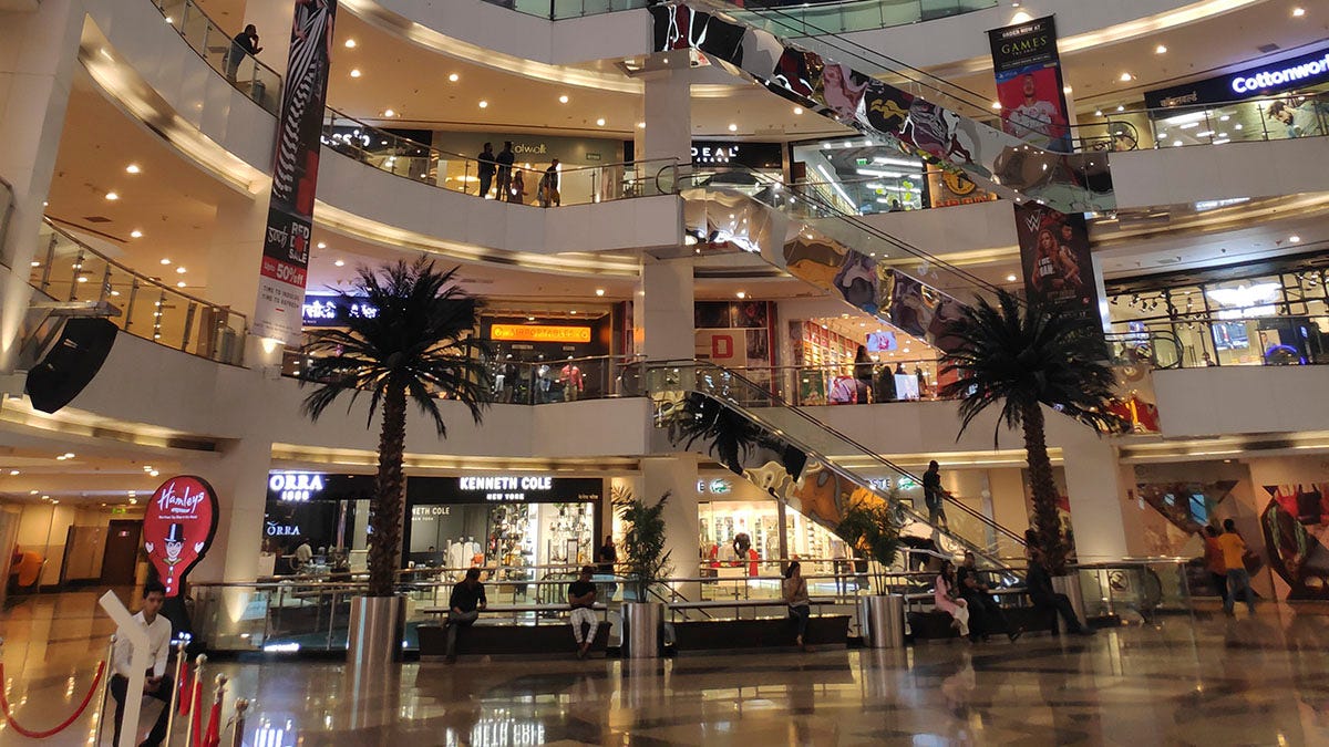
It was the Infiniti Mall in Malad, Mumbai (seen below) and the mall has more than 200 stores and 23 kiosks. The mall is known for housing a wide variety of international and national brands. Here is a link to the mall’s website that has a list of all the stores in that mall.
The brands were trying to communicate something to me using typography, colours and symbols but they were all doing it in different ways. I kept walking and looked for more clues and possible answers. I realized that the brand name, brand colours and brand symbol were consistently presented and promoted in different ways inside each store too. What was the brand trying to tell me? Was this merely a capitalistic relationship? Or was the brand trying to do a bit more? Was the brand trying to convince me to buy their product or service by building a relationship with me?
But how can a non living entity like a brand build a relationship with a living entity like a human being without any conversation or dialogue?
I feel like they use typography, symbols and colours that already have strong mental associations in the minds of a consumer.
The brand tells a story about their product or service using these elements and humans always love a good story.
Eventually we buy the story before we buy the product or service because the brand has made their narrative part of our narrative by using typography, logos and colours in a consistent and aesthetic manner.
I wanted to challenge and understand this personal observation and realization better. I decided to spend more time walking around the mall and thinking about my relationship to these brands. I chose ten brands and then decided to visit their retail stores at the mall that day. I planned to walk around these ten stores like a potential customer and then reflect on my experience in each store. The stores were:
Smart Bazaar Departmental store & hypermarket
Lenskart Eyewear & Watches
Bodhi Thai Spa Health, beauty, Salon & Spa
Raymond Men's Wear
Hamleys Gifting, Novelties & Stationery
The Bombay Store Home & Lifestyle
Metro Foot Wear
Asics Store Active Wear & Sports
Mama Earth Health, Beauty, Salon & Spa
The Souled Store Unisex wear
I found the setting of a mall quite interesting for this thought experiment. Many of the retail stores had the same store size or same store structure. Some brands bought space for 3-4 stores (like the department store of the unisex wear store). However the way each brand utilized these spaces was very different depending on what product or service they wanted to sell to the potential customer.
Questions these Retail Stores provoked in my mind
As I walked through each store I used some guiding questions to observe this specific physical setting:
What kinds of products and services were sold at this store?
What colours were most prominent in the store layout and displays?
What kind of typography was used around the store and what its effect on you?
What brand symbol or brand logo was used to represent the brand? Did this brand symbol or brand logo have a strong connection to the products and services being sold?
What kind of lighting was used in the store?
What kinds of sounds and noises did you hear around the store?
How much space did you have to walk around the store?
Did the staff approach you immediately or let you browse around first?
Did the store sell their products online as well?
What kinds of shelves and storage spaces were used to sell the products/services?
Through these questions and my visit to these stores I wanted to understand how brands use typography, colours and symbols to build a relationship with me as a potential customer. I was trying to find answers to these questions as I walked through each store and spoke to their sales representatives.
Resources on Typography, Color Symbolism and Logos
Now, I had no background in design or branding. So I spent some time after the mall visit reviewing these videos on typography, colour symbolism and brand symbols/logos. It helped me reflect and think about other possible connections I may have missed during my walk around the mall that day.
From this video I learned that typography is the style or appearance of text.
From this video I learned that humans associate certain emotions, objects or abstract ideas with certain colours.
From this video, I learned that brand symbols or brand logos are the primary visual identity of a brand and these brands use a symbol, font or colour to sum up the whole meaning of the brand.
I had some questions and some background information to understand how these brands were trying to communicate with me and build a relationship with me as a consumer.
In the rest of this essay I want to write about what I observed, noticed and then thought about as a potential customer at these retail stores in that mall. I used the questions and my limited understanding of branding, colour symbolism, typography and logos to engage and enhance my experience at these stores.
I have used images from the mall website in the rest of this essay. Please find links to the store profiles from the mall website linked below. All credit for these images go to the brands discussed and the mall promoters.
Smart Bazaar Departmental store & hypermarket
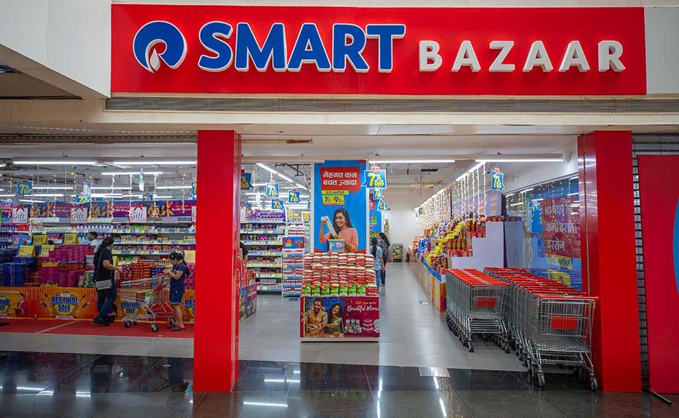
Smart Bazaar (link to company website) is operated by Reliance Smart Bazaar. This departmental store in the Mall offers a wide range of fresh produce, bakery items, dairy products, and household essentials.
The colour red stood out for me as I entered the store. The brand word mark was in a blue and white text and was set against a red background. It reminded me of the red used in traffic lights. It made me stop and take notice. It is also a very busy storefront because this is a department store that has a large variety of products to sell. Unlike a clothing store, these products are packed together tight on shelves that are really close to each other. The typography, colours and logo of this brand made me feel like I was in a family friendly environment that was created by a large corporate organization. There is a call to action at the entrance itself because they realize that customers have a lot to choose from in this setup. The brand logo is a word mark and a logo mark and communicates reliability and consistency.
Lenskart Eyewear & Watches
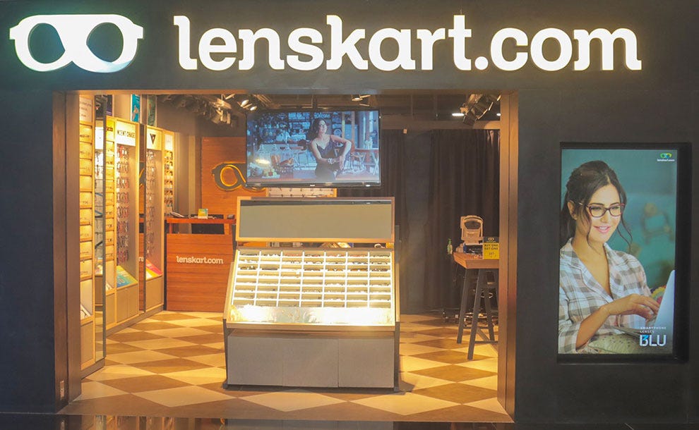
Lenskart (link to company website) is an Indian multinational eyewear company. As a vertically integrated company, it designs, manufactures, distributes, and retails prescription and regular eyewear. It sells its products through website, mobile app and 2,000+ physical stores.
The bright white logo on top and the warm yellow light inside the store stood out for me as I entered this store. This was a much smaller store. The brand logo and brand work mark on the store front reminded of a bright white tube light that is used in a crowded train compartment or office building. Inside the store, the eye glass shelves are mostly placed close to the walls. There is one central shelf but I was not sure what the purpose of this shelf was when I first entered because of the lack of signage. There was enough space to walk around the store. I liked that they had different shelves for different kinds of eye glass brands. The typography, colours and logo of this brand made me feel like I was in a store for young upwardly people in urban metros that wanted stylish glasses for different purposes and events. The brand logo is a word mark and logo mark and it reminds me of the lenses they use when you visit an optometrist and thus it has good brand recall overall.
Bodhi Thai Spa Health, beauty, Salon & Spa
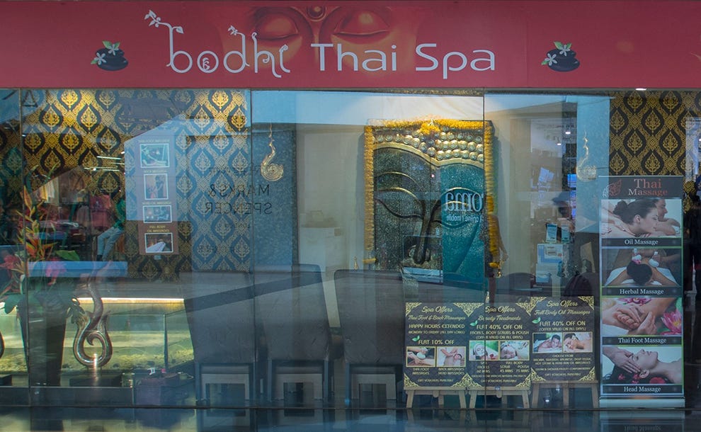
Bodhi Thai Spa (link to company website) is a one-stop-destination for all your Spa needs. From the traditional thai foot reflexology to Full Body Oil Massages, and from exotic spa facials to full body polishing and scrubs, Bodhi Thai Spa focuses on quality spa therapies inspired by the Thai & Balinese philosophy.
The image of Buddha in the background of this store and the yellow wallpaper made me think about lots of calm and peaceful associations and South East Asian culture. The same image of Buddha’s eyes is used in the background on the store signage. The word ‘bodhi’ is in cursive and ‘thai spa’ is in regular font. The typography, colours and logo of this brand made me feel like I was on a vacation and spending the day at a spa in a South East Asian country. They have put lots of signage in the glass window to inform the customer about all their available services. The brand logo is a word mark and it reminds me of trees and sitting peacefully with nature and yourself.
Raymond Men's Wear
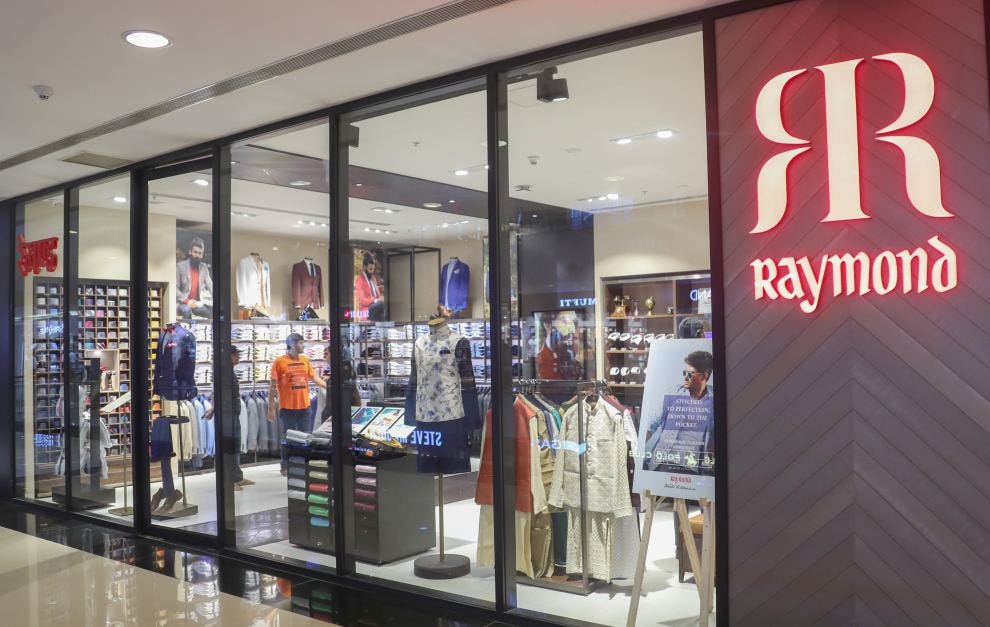
Raymond (link to company website) is known for their exquisite ethnic, indo-western formal and casual fashion apparel. This outlet sold men’s wear produced by this brand.
The organized shirt shelves stood out for me as I entered the store. The shirts are placed in a neat and organized way in a variety of colours. This convinced me that they have a lot of options. The brand logo is the letter, ‘R’ set against another, ‘R’ and this gives you the thought of a mirror where you look at your clothes and see if they fit you well. There were few promotional signs placed around the store and the customer representative team were also wearing Raymond suits and shirt. The typography, colours and logo of this brand made me feel like I was at a high end tailor that created custom suit designs for people that worked in a corporate setup or were attending an important family event. The brand logo is a word mark and logo mark. The word mark and logo mark was hard to decipher and did not have a strong impact on me as a consumer.
Hamleys Gifting, Novelties & Stationery
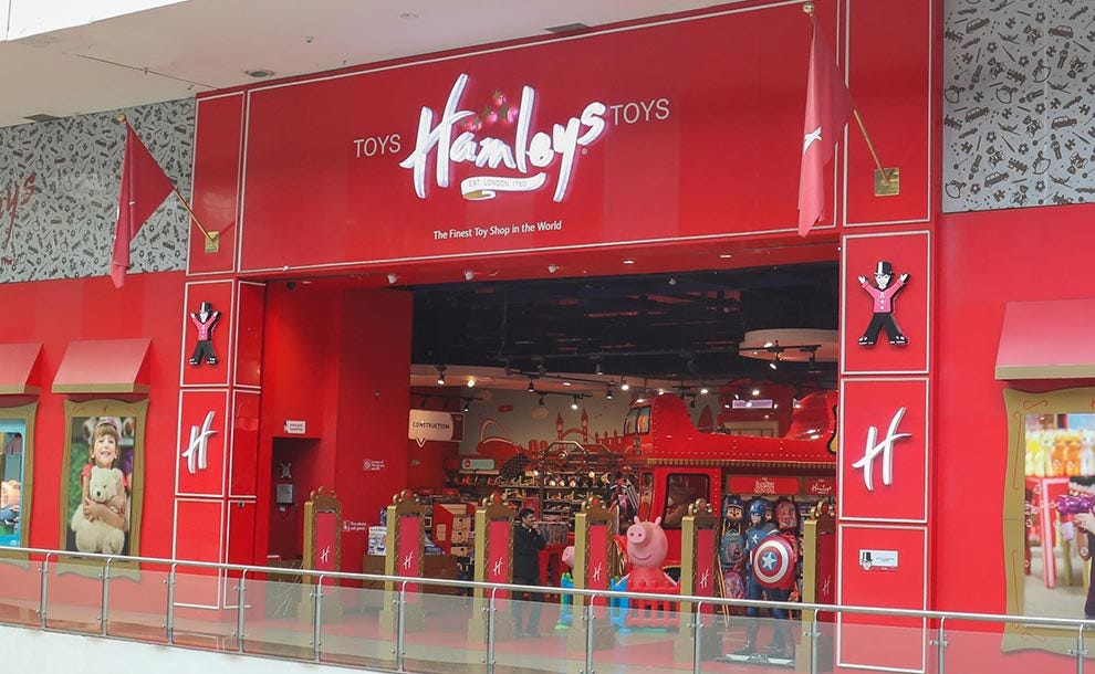
Hamleys (link to company website) is a multinational toy retailer that tries to bring joy to children and families with its wide range of toys, interactive demos, and fun-filled experiences. From classic favorites to quirky collectibles, Hamleys Malad offers something for every age.
The colour red and the fun toy displays stood out for me as I entered the store. This is a large store and all the wall papers are connected to toys and the city of London where the Hamleys brand originated. There are lots of opportunities to try to out toys and this gives the final consumer a chance to experience the product before buying them. This would make children very happy and parents very nervous. There are different sections like board games, blocks, sports tools, construction toys, soft toys within the store. They are all divided by clear white signage (see construction sign in the background). The typography, colours and logo of this brand made me feel like I was visiting a toy store in a large city like London, New York, Singapore or Colombo and was bringing back gifts for my family after a long work trip. The brand logo is a word mark. It is quite playful and it reminded me of the human handwriting and the way children draw and write.
The Bombay Store Home & Lifestyle
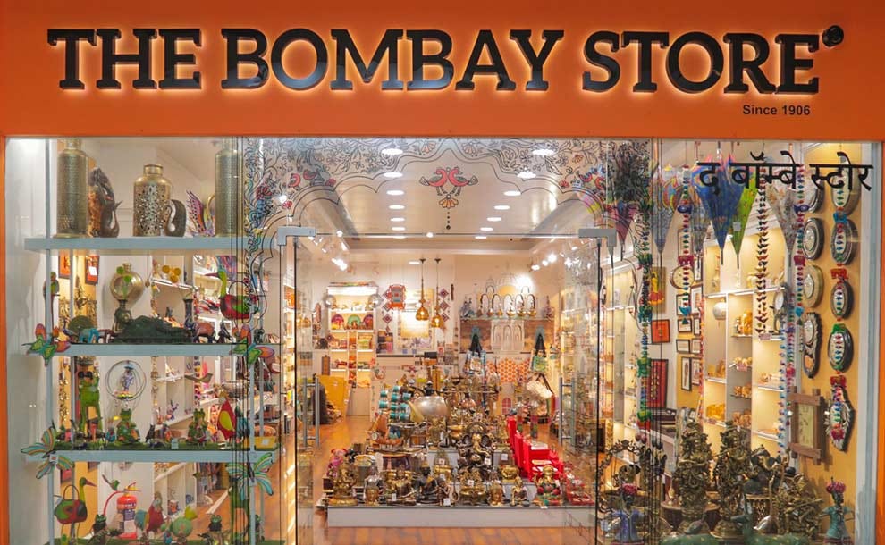
The Bombay Store (link to company website) was established during the Swadeshi movement by iconic leaders like Lokmanya Tilak and JRD Tata, the store continues to celebrate Indian craftsmanship with a modern twist.
The large collection of statues on the glass wall displays stood out for me as I entered the store. It is a very busy store front and it does look like they sell gifts and home decor items inspired by India. There are lots of white shelves against the walls and central white shelf display in the middle of the store. You have to be careful walking around the store because there are lots of fragile items placed at the edge of these shelves. The lighting is a mix of bright white and warm yellow. I like the wooden flooring and it did add to the atmosphere of the store. The typography, colours and logo of this brand made me feel like I was shopping for gifts after returning home from an international vacation. The brand logo is a word mark and has the name of the brand in serif font against an orange background. It communicates a sense of history and old world charm.
Metro Foot Wear
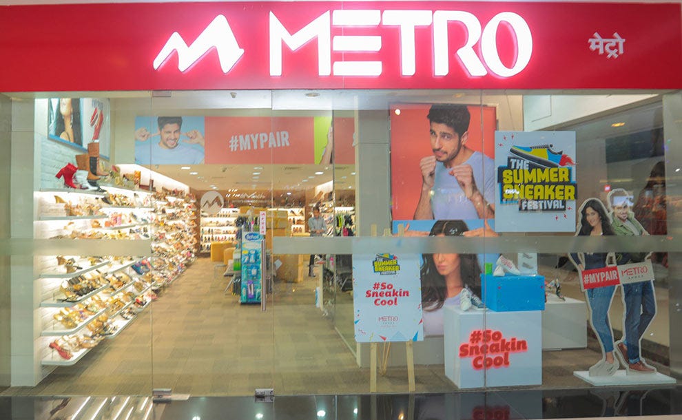
Metro Brands (link to company website), previously known as Metro Shoes, is an Indian multi-brand footwear retail company.
The current brand campaign stood out for me as I walked into the store. It used a hashtag #sosneakincool to promote the shoes and footwear being sold by the store. The brand ambassadors images are placed all around the store. The typography, colours and logo of this brand made me feel like I am buying shoes that I can wear comfortably as a I travel around a large urban Indian metro. The brand logo is a word mark and logo mark. The logo is a stylized version of the letter, ‘M’. The word mark is the brand name, ‘Metro’ in white bright lights against a red bright background. It reminds me of a traffic light and catches my attention.
Asics Store Active Wear & Sports
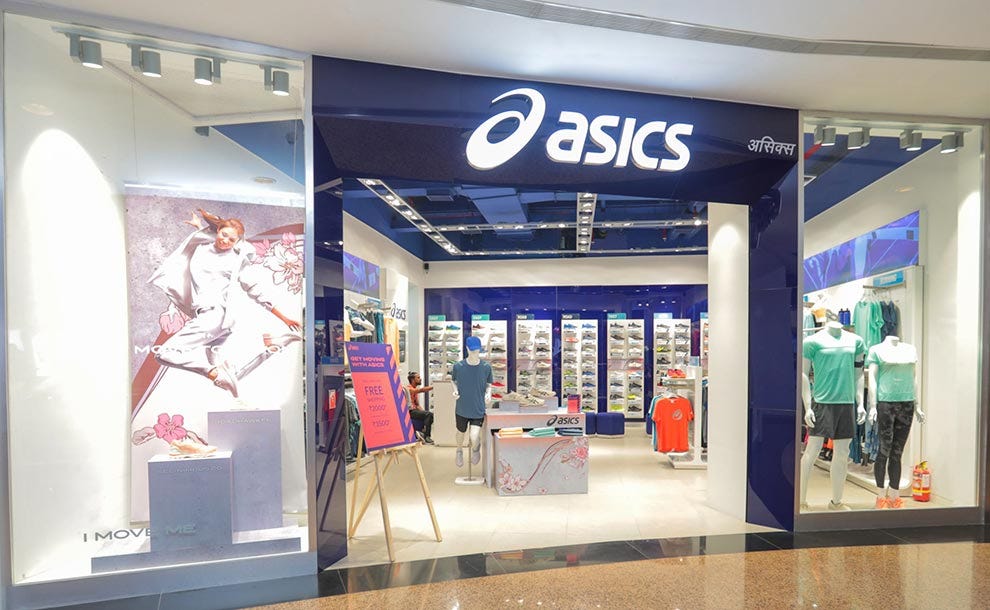
ASICS (link to company website) has been developing sports footwear and apparel for more than 50 years. It is also my favourite sports shoe brand and I have purchased shoes from them regularly for the last 10 years.
The colour blue and the mannequins wearing sports wear stand out for me as I walk into the store. The shoes are placed front and centre at the back of the store. The clothes and active wear are placed on shelves along the side walls of the store. The store does give me a minimal vibe as seen from the display on the left with only one shoe placed on a stand. The typography, colours and logo of this brand made me feel like I was preparing for a marathon and was buying equipment to prepare for this race after training for over a year. The brand logo includes a logo mark and a word mark. It reminds me of a person running in the open with the oceans or mountains in the back.
Mama Earth Health, Beauty, Salon & Spa
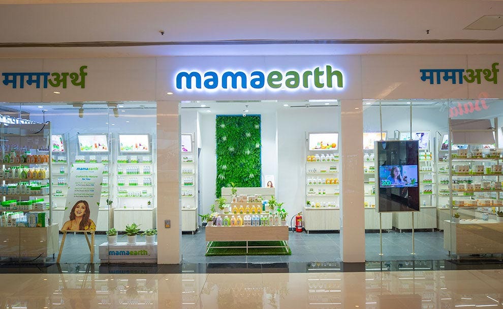
Mamaearth (link to company website) offers products for skincare, hair care, body care, baby care, and makeup needs.
The green plant wall and large white walls stood out for me as I walked into the store. The show gave me the vibe of a a peaceful meditation centre. There are lots of plants kept around the store. The store is also quite spacious with lots of empty space to walk around and the shelves are not cluttered with too many products as well. The typography, colours and logo of this brand made me feel like I was buying skincare or haircare products for my older parents or young children. The brand logo is just a word mark of the word, ‘Mamaearth’ against a white background. It reminds me of the unconditional love and care every mother offers her child and thus conveys reliability and trust.
The Souled Store Unisex wear
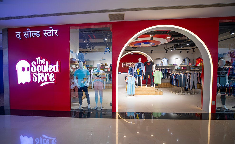
The Souled Stores (link to company website) creates and curates stunning designs and print them on all sorts of equally stunning products- from t-shirts to phone covers to backpacks to boxers to mugs to socks to badges to pins to hoodies and many more.
The image of the ghost and the colour red stood out for me as I walked into the store. It is very different from the formal logos and word marks I saw in other stores around the mall. Thus the branding of this store was a refreshing change in that mall’s context. The energy of the brand is youthful and energetic. There is a large Captain America shield on top of the store. There are lots of popular culture references spread across the store and that makes this a very hip and trendy brand. The typography, colours and logo of this brand made me feel like I am a college student buying clothes with some money I have saved up over the holidays. The brand logo includes a word mark and a logo mark. The logo mark is the image of a ghost. The word mark is the name, ‘The Souled Store’ in a fun font and it reminds me of the Comic Sans font a little a bit.
How brands build relationships with customers using typography, colours and symbols?
The best way for a brand to build a consumer relationship is to solve a problem faced by that customer.
But how do you differentiate yourself when a lot of brands are trying to solve the same problem for that customer. You tell a story that helps you build an emotional bond with the customer. Once a customer connects with your brand emotionally they will continue to buy your product or service even with all the available competition.
The best brands in the world tell really good stories using typography, colours and symbols. Think about your favourite brands for each product or service category. How would you convince someone to purchase a product or service from this brand and not any other brand? What story would you tell them about this brand?
It was 10 pm by the time I left the last store at the mall. It was a long day. There was a lot of walking and talking. On the way back home, I realized that all brands sell their products and services by telling you a story about an ideal consumer and how their life improved in some way by engaging with the brand. They use marketing, advertising, branding, social media and other business tools in creative ways to convince you about this story.
The most important ways for a brand to communicate with a potential customer are the brand symbols, brand colours and brand typography. It is the first thing a customer will see when they interact with a brand in the physical or digital world.
I found this mall setting really interesting and thought provoking in the context of interacting with these brands. A mall is one of the few physical spaces where a lot of brands get a chance to simultaneously connect with the same set of customers through retail spaces in a large commercial setting. As I walked through the mall I realized that many of these brands were using the same set of tools that artists use to create art. However the focus of each brand was clearly commercial and not emotional or aesthetic.
Brands use colours, typography, symbols to sell a product or service. They call this business story telling. These brands do a really good job because most customers end up buying a lot of products and services when they visit Infiniti Mall in Malad, Mumbai.
Thanks for reading this essay. It helped me reflect on my relationships with brands. It got me thinking about why I choose one brand over another brand. I have started looking at brands differently now. All the digital and physical advertisements by a brand are just attempts to build a commercial relationship with me. I have sustained and nurtured some brand relationships and have ended many others. I continue to relate to a few brand stories while I have outgrown many others. I am curious about your thoughts.
What is your favourite brand?
What do you like about their brand logo? What do you think about when you think about the colours used by this brand? What other places have you seen the typography used by this brand? Who is the ideal customer for this brand? How does this brand make you feel when you enter their store? When was the last time you purchased something from this brand? How does the branding change in physical and digital settings for this particular brand? Why do you continue to purchase things from this brand? Have you convinced a friend or family member to buy something from this brand? Have you had any negative experiences with this brand? Have you ever used a competitor brand’s product or services? What was the last advertisement you remember seeing of this brand? Do you still have positive associations with this brand?
Share your thoughts or observations or answers to any of these questions in the comments below.
Until next time,
Keep Learning
Abhishek
Web Links
Infiniti Mall Malad Website - https://www.infinitimall.com/